Focacciamo
De Focaccia y mangiamo.
Packaging Design, Collateral Design
2023
The Brief
Focacciamo is a Madrid-based restaurant offering gourmet focaccias with a unique twist. For their branding, we drew inspiration from the minimalist elegance where less is more but executed to perfection. We aimed to create a brand collateral and a website that would make Focacciamo stand out in the trendy gastronomic landscape, reflecting the simplicity and authenticity.

The Solution
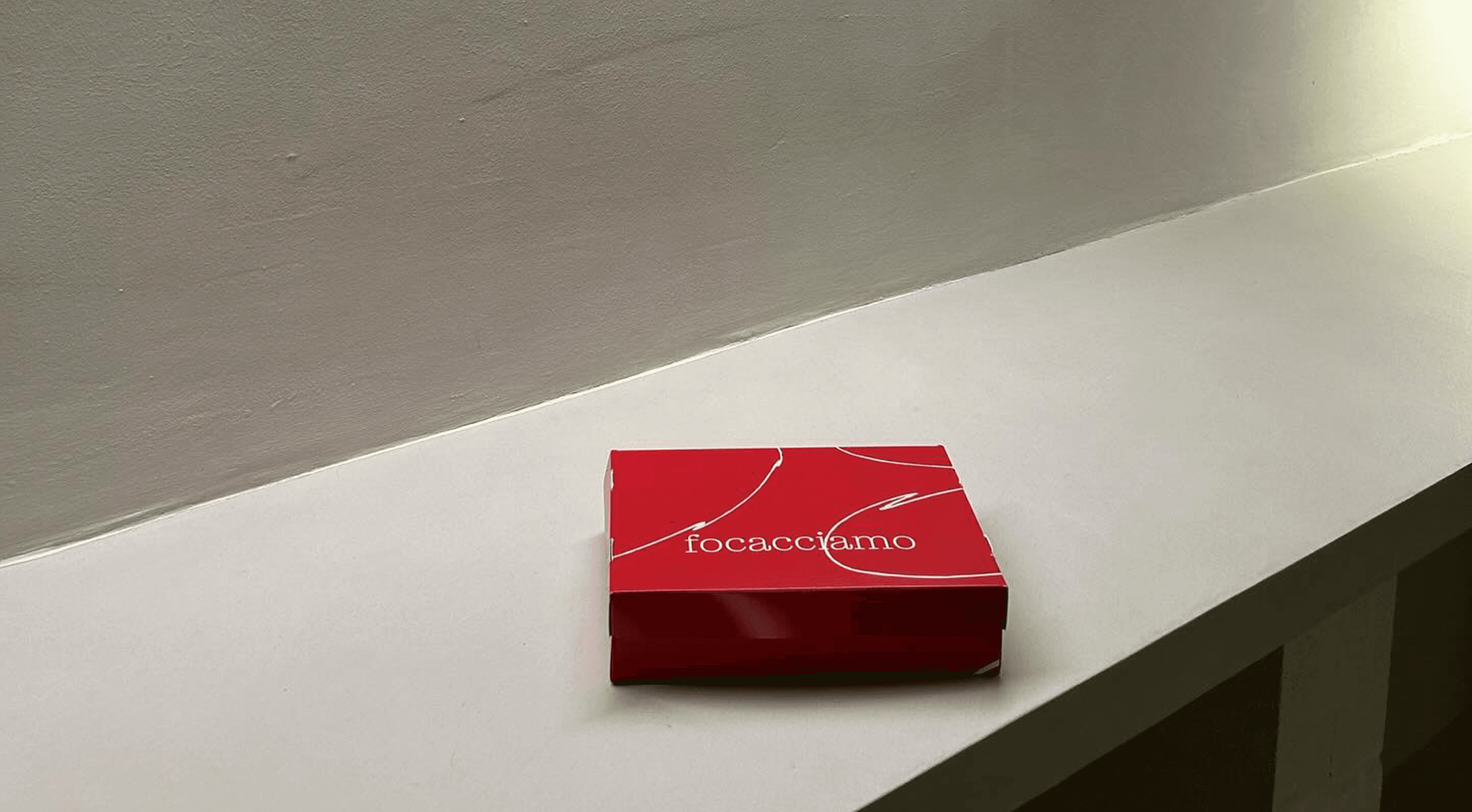
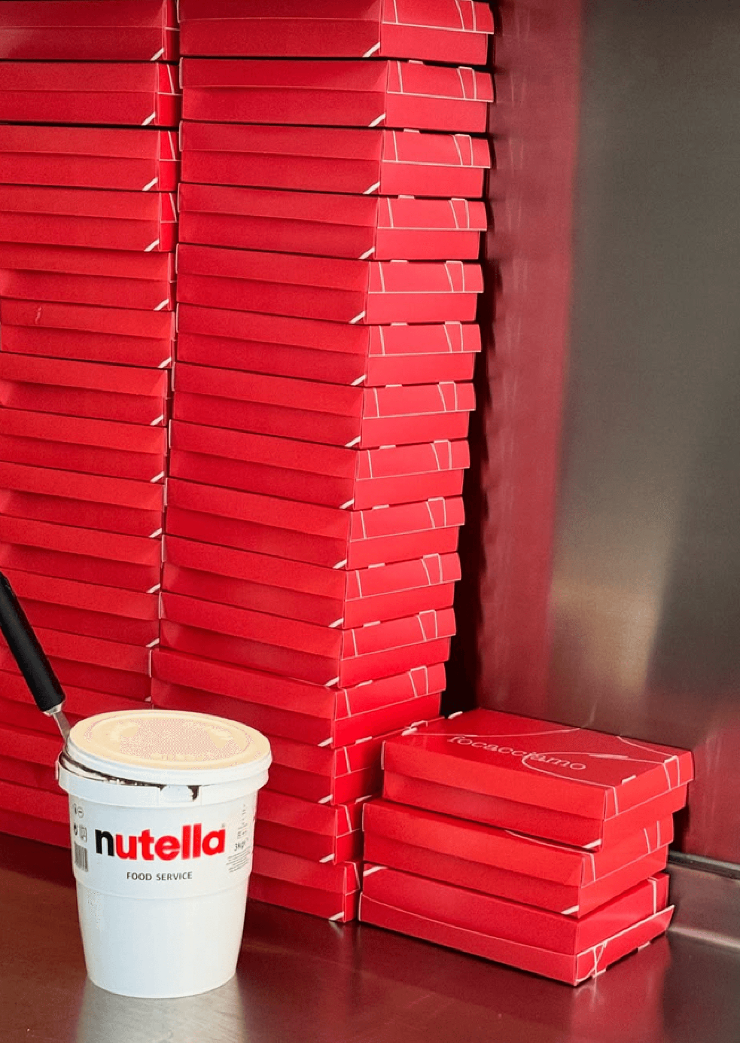
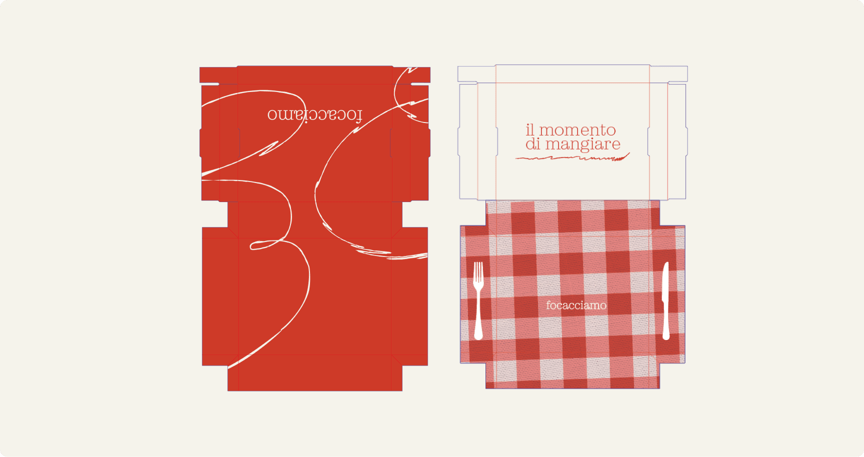
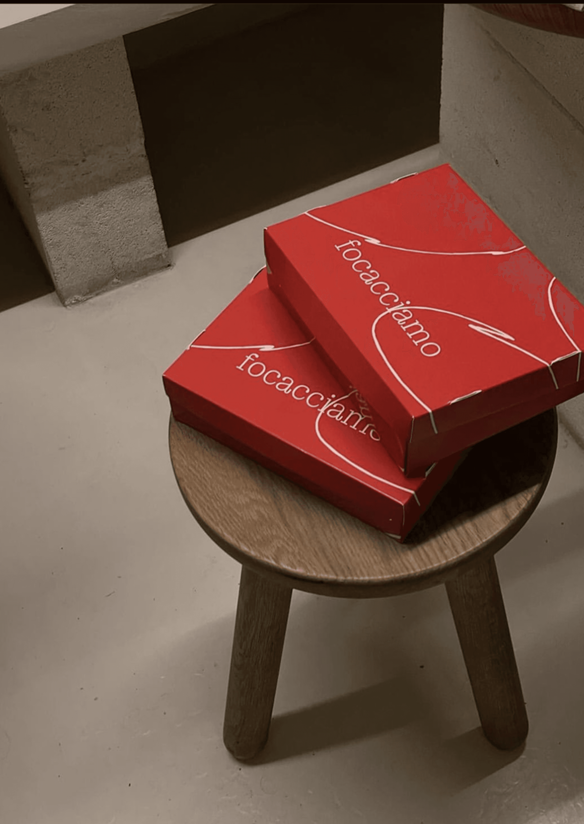
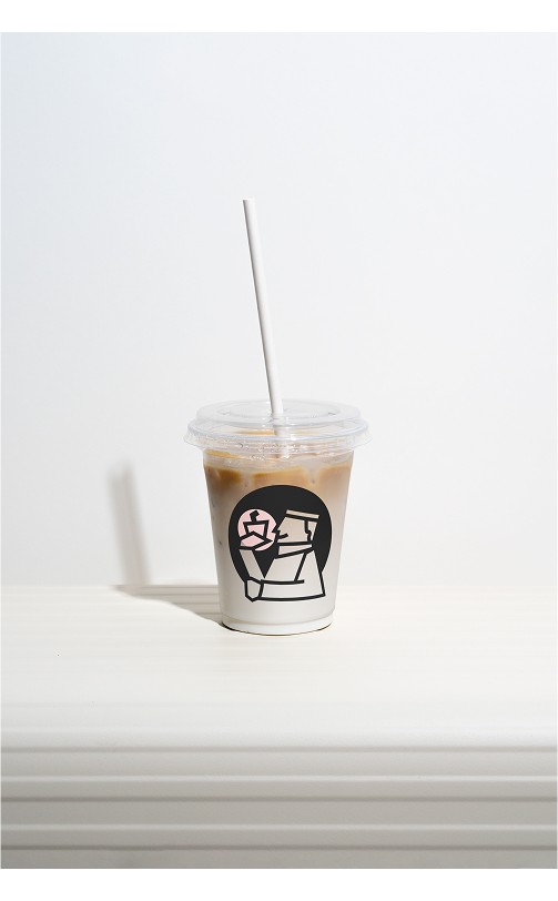
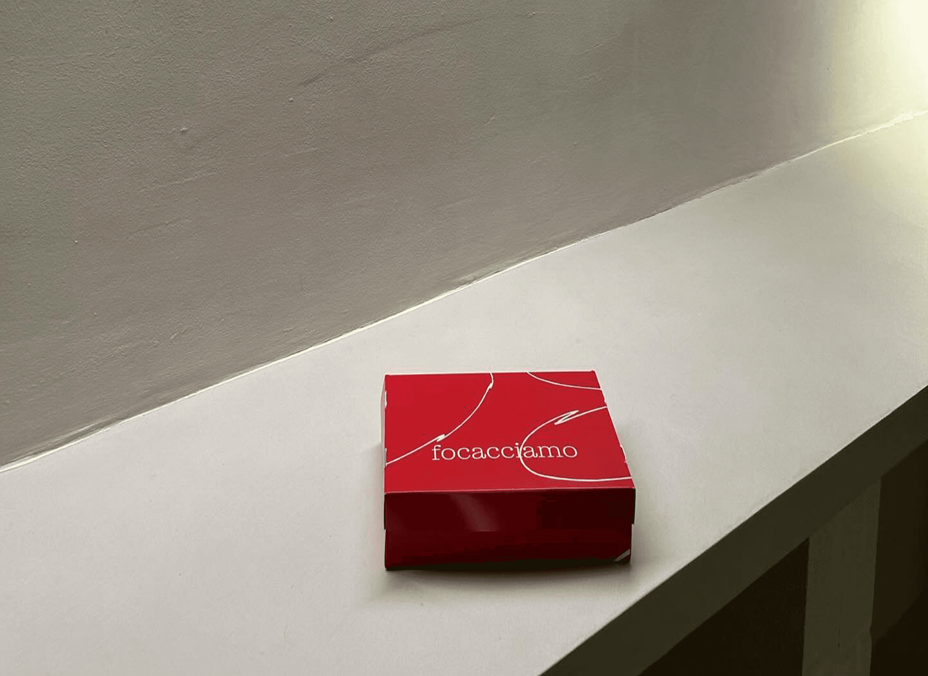
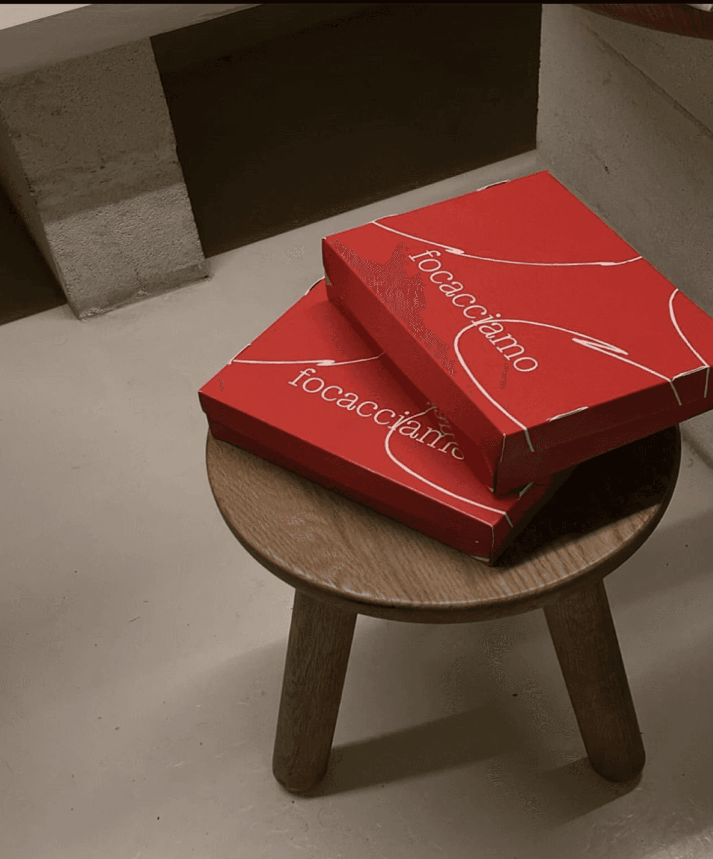
The solution was a clean, impactful visual language with minimal yet powerful design elements. The brand’s look and feel reflect a balance between sophistication and playfulness, with carefully considered elements that evoke the feeling of an authentic yet modern culinary experience. To ensure consistency across all touchpoints while leaving room for delightful moments of surprise, like hidden messages and unexpected details that create “aha” moments for the audience. This approach was also reflected in the packaging design, where each element served a purpose while delighting the senses.
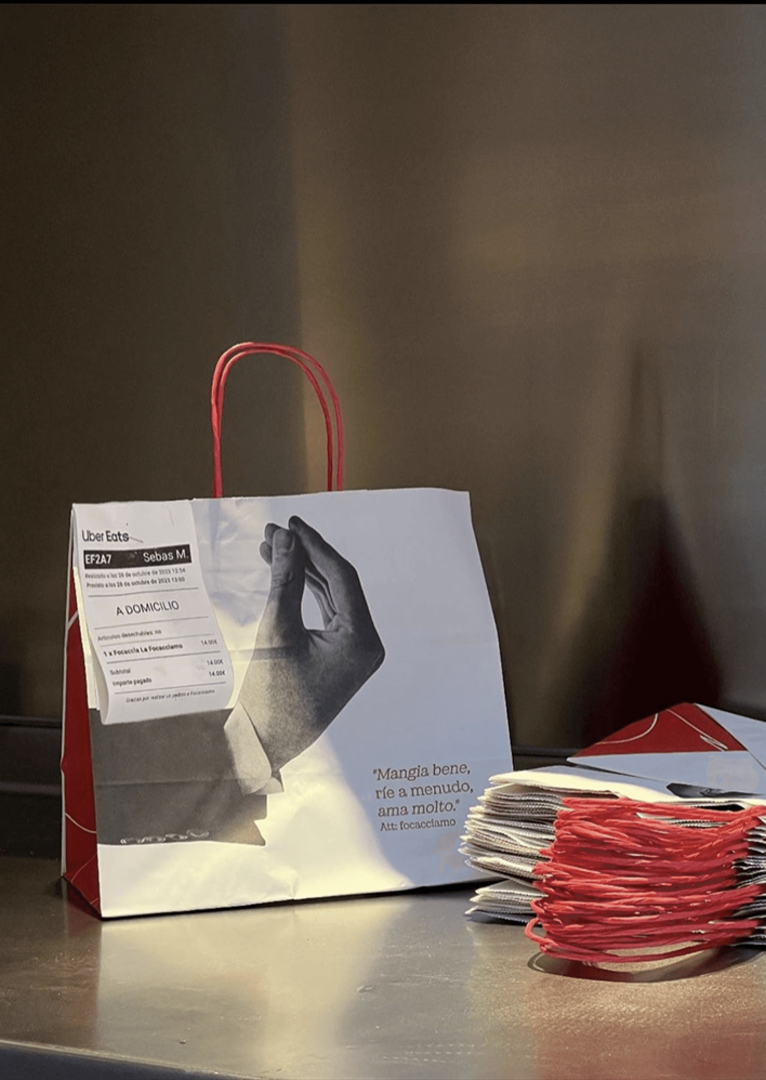
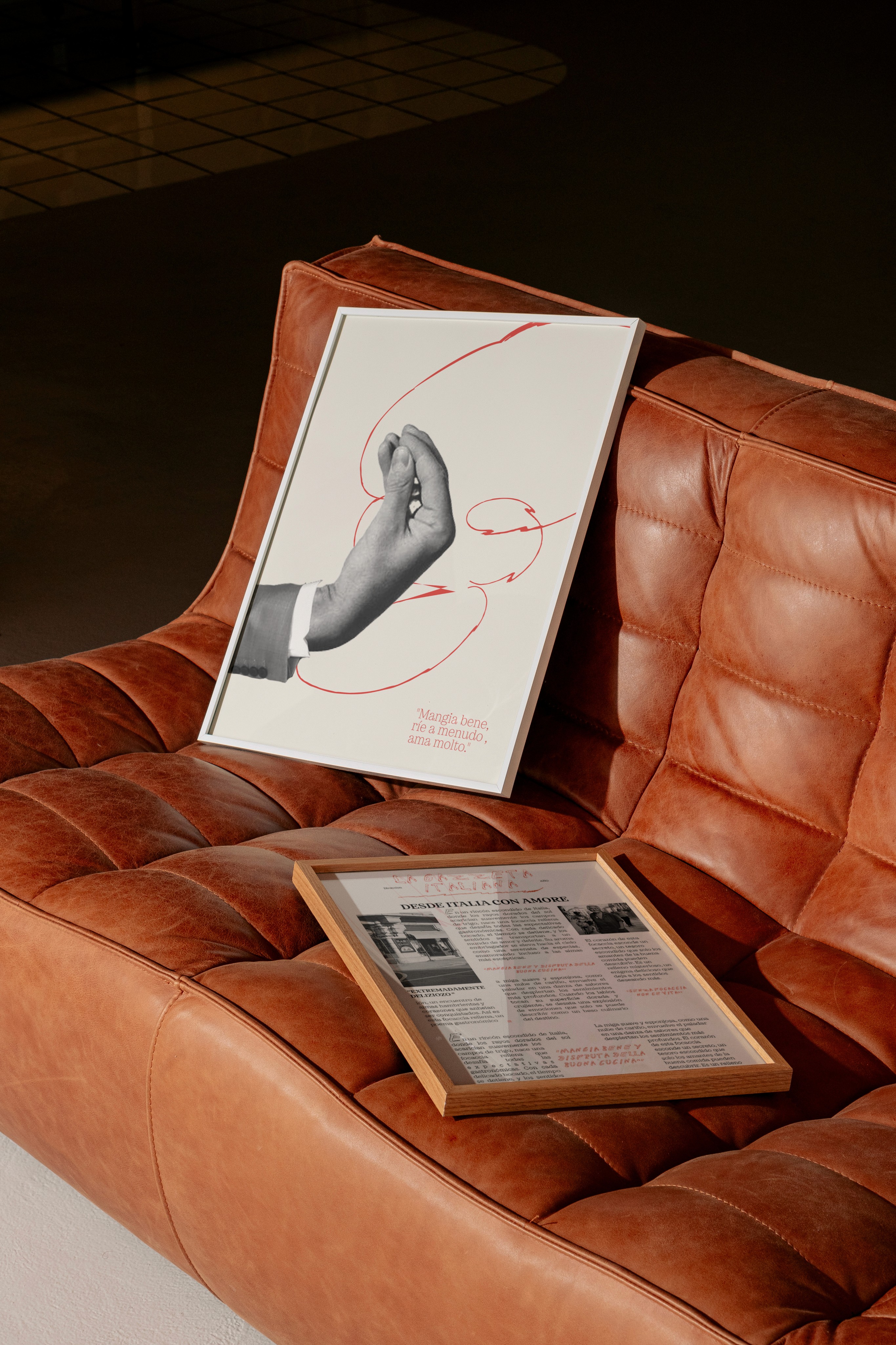
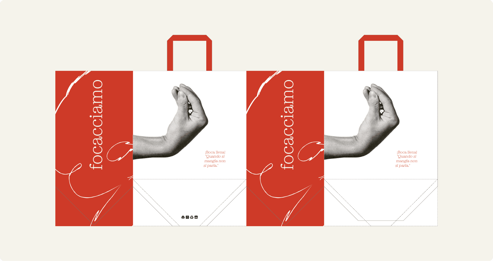
Drawing further inspiration from Bruno Munari’s "Speak Italian," which explores the power of Italian hand gestures and the ability of simple images to convey complex messages, we set out to create an engaging visual language that communicates both the authenticity of their cuisine and an element of fun, bringing moments of surprise to their audience.
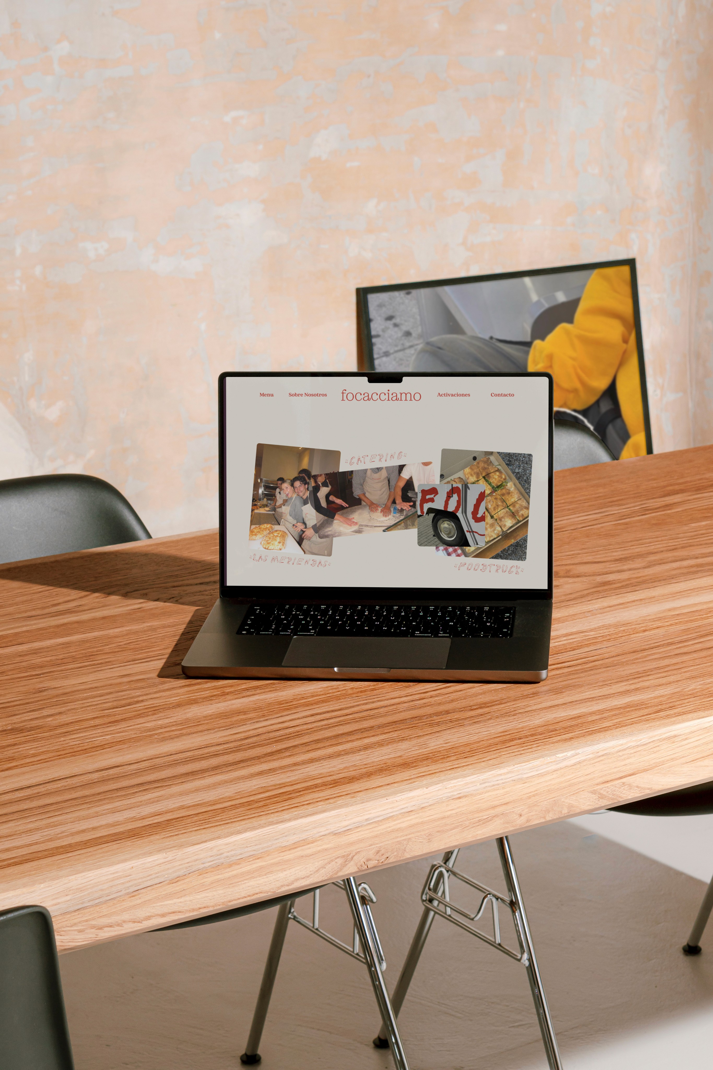
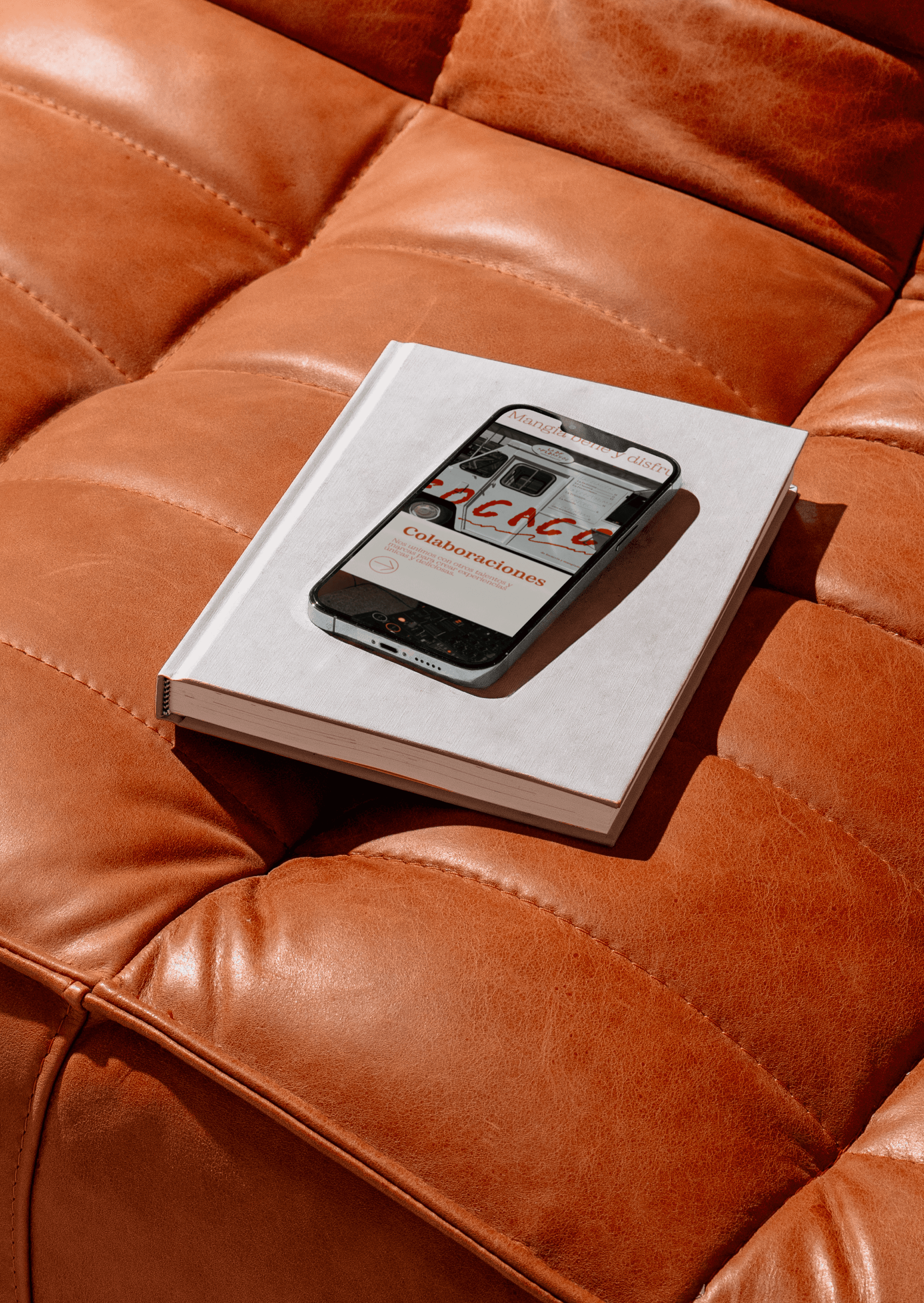
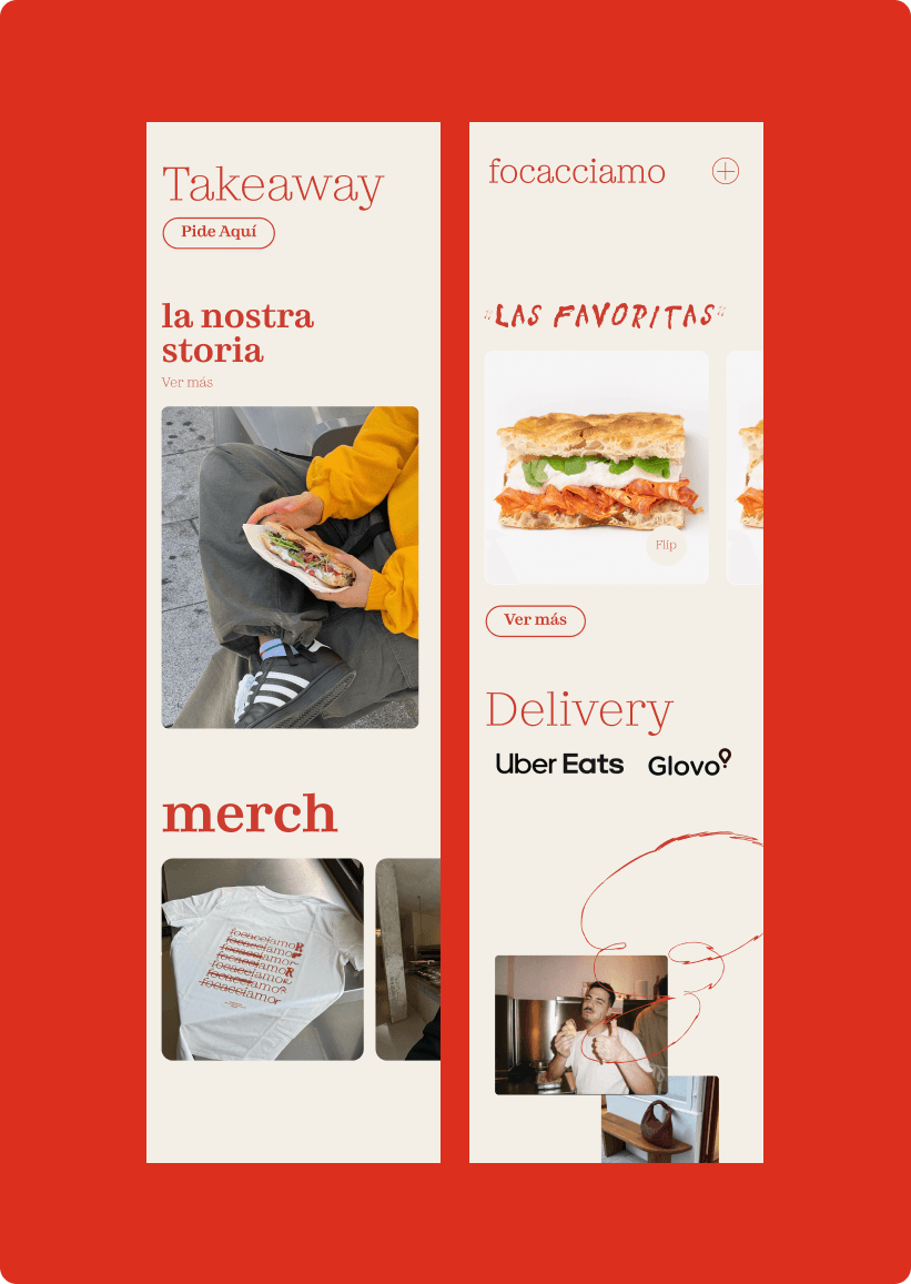
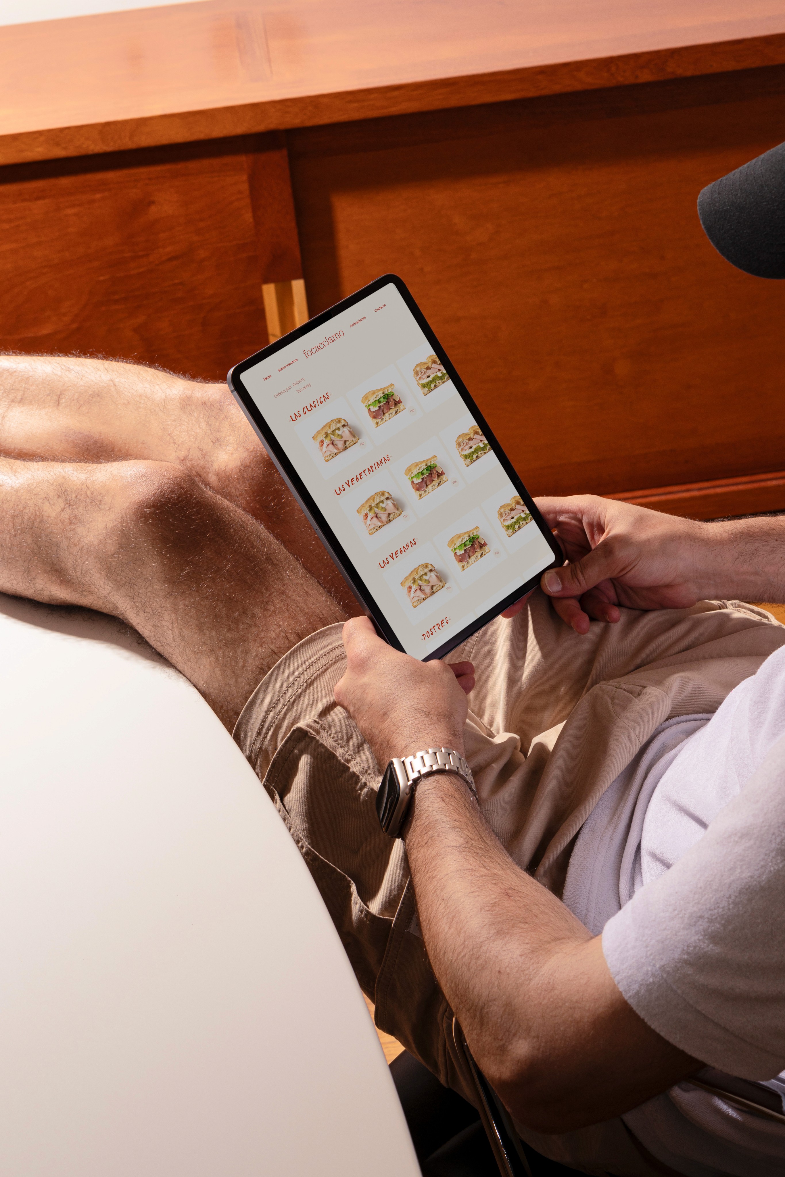
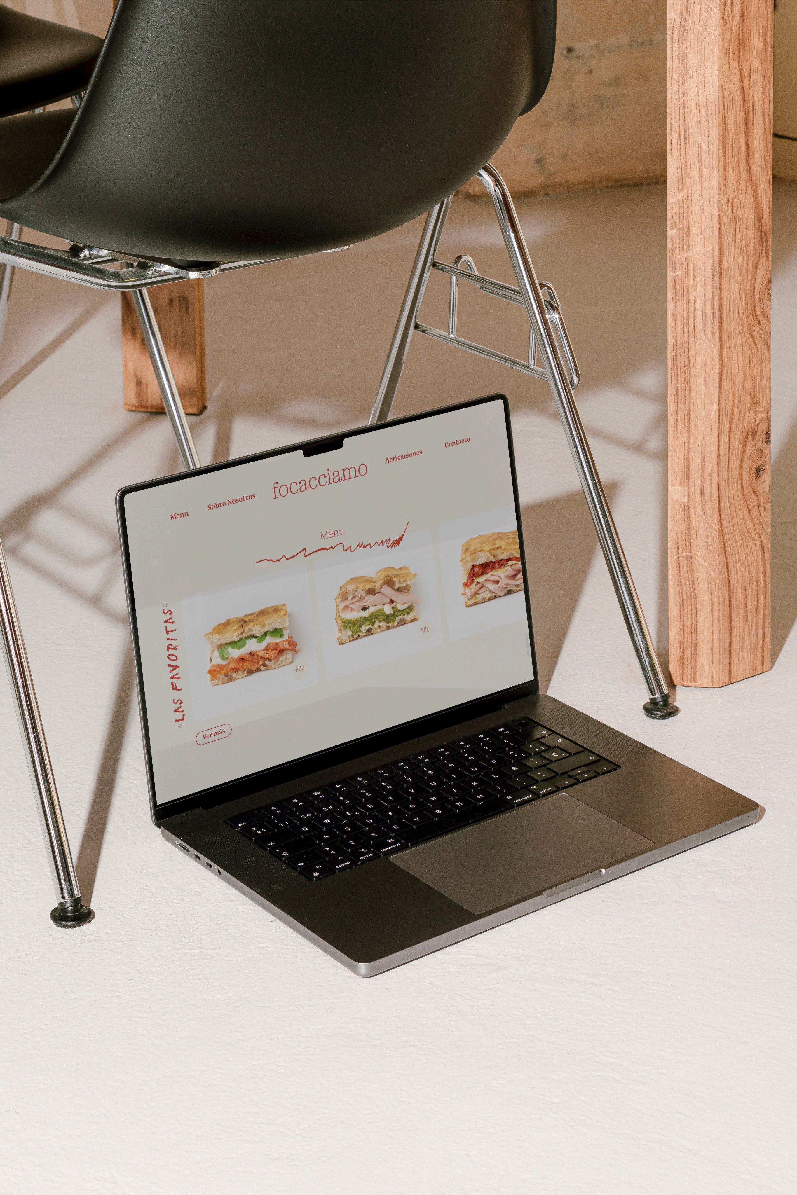
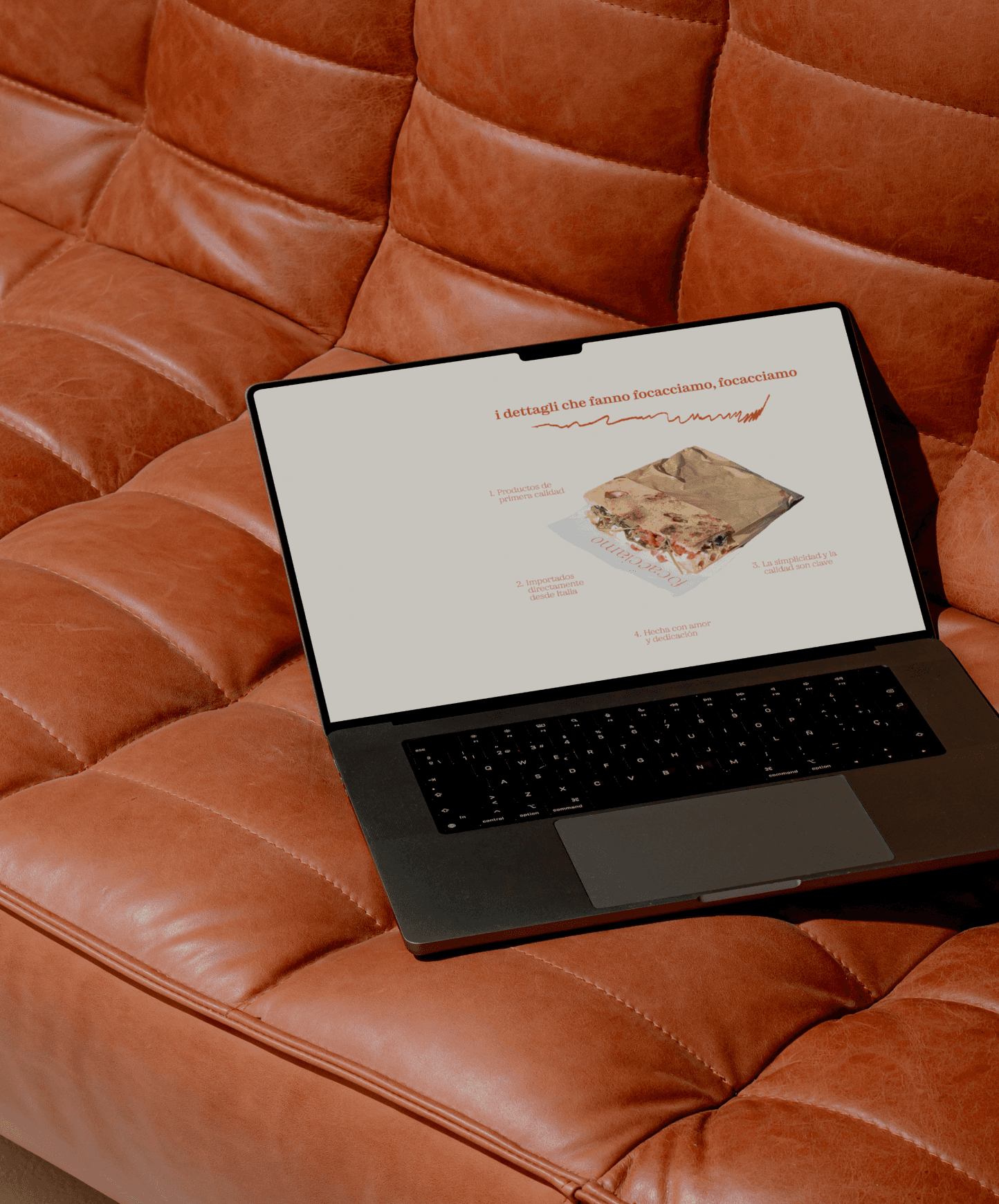
For Focacciamo's website, we focused on a simple yet stunning design that allows the product and experience to shine. The site was built with a clean and intuitive user experience, showcasing their products in a minimalist, yet engaging way. Key features included smooth navigation, an easy-to-use menu, and a seamless ordering system. The imagery on the site highlights the natural beauty and simplicity of their focaccias, with a focus on high-quality photos that evoke warmth and craftsmanship.
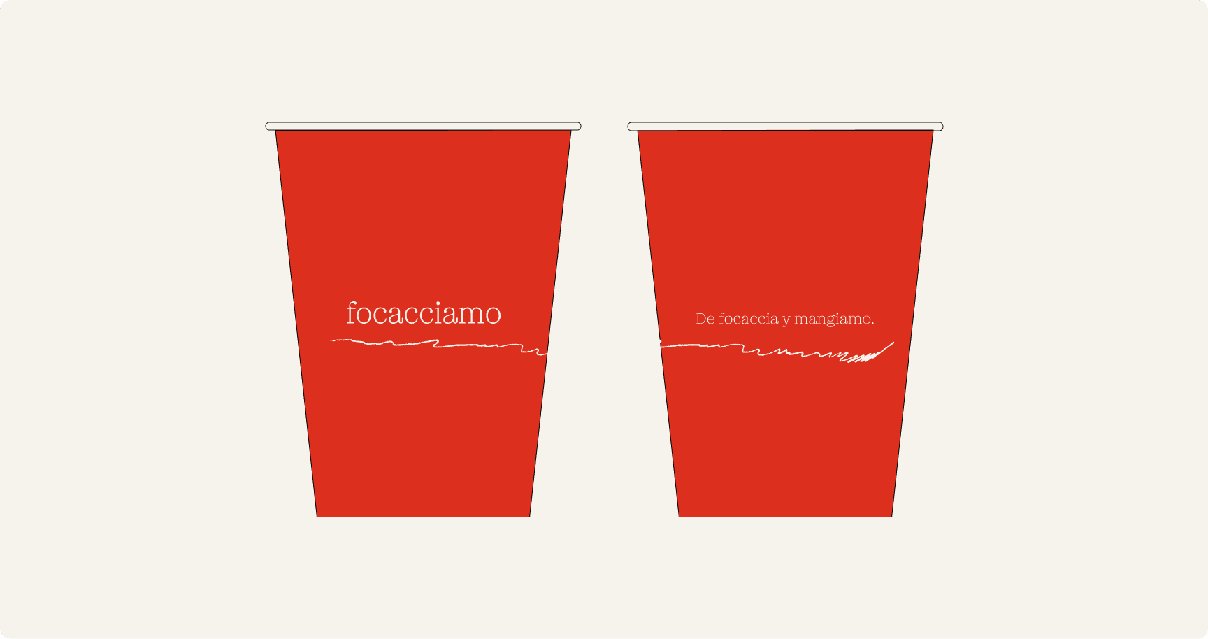
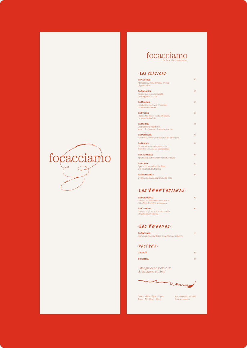
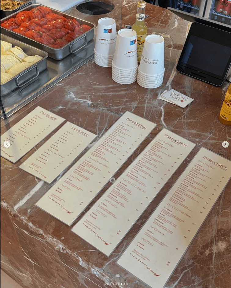
The packaging and other collateral elements were designed to reflect Focacciamo's clean, minimalistic aesthetic while injecting a playful twist. Inspired by the idea of “less is more” from Nordic design principles, we created packaging that felt elevated and simple, yet interesting and surprising. The use of thoughtful typography and subtle patterns, with moments of visual surprise, ensures that each touchpoint—from the packaging to the menu—is cohesive and delightful. The result is a brand identity that is sophisticated, authentic, and full of personality.
View More
FreshMint
View More
Sunny & The Juice
View More

Joy to the Fluff
View More
Let’s work together!
Book a Discovery Call

Focacciamo
De Focaccia y mangiamo.
Packaging Design, Collateral Design
Madrid, ES
2023
The Brief
Focacciamo is a Madrid-based restaurant offering gourmet focaccias with a unique twist. For their branding, we drew inspiration from the minimalist elegance where less is more but executed to perfection. We aimed to create a brand collateral and a website that would make Focacciamo stand out in the trendy gastronomic landscape, reflecting the simplicity and authenticity.

Home
Services
Work
Approach
Insights
play
inquire

The Solution
The solution was a clean, impactful visual language with minimal yet powerful design elements. The brand’s look and feel reflect a balance between sophistication and playfulness, with carefully considered elements that evoke the feeling of an authentic yet modern culinary experience. To ensure consistency across all touchpoints while leaving room for delightful moments of surprise, like hidden messages and unexpected details that create “aha” moments for the audience. This approach was also reflected in the packaging design, where each element served a purpose while delighting the senses.

Drawing further inspiration from Bruno Munari’s "Speak Italian," which explores the power of Italian hand gestures and the ability of simple images to convey complex messages, we set out to create an engaging visual language that communicates both the authenticity of their cuisine and an element of fun, bringing moments of surprise to their audience.
For Focacciamo's website, we focused on a simple yet stunning design that allows the product and experience to shine. The site was built with a clean and intuitive user experience, showcasing their products in a minimalist, yet engaging way. Key features included smooth navigation, an easy-to-use menu, and a seamless ordering system. The imagery on the site highlights the natural beauty and simplicity of their focaccias, with a focus on high-quality photos that evoke warmth and craftsmanship.

The packaging and other collateral elements were designed to reflect Focacciamo's clean, minimalistic aesthetic while injecting a playful twist. Inspired by the idea of “less is more” from Nordic design principles, we created packaging that felt elevated and simple, yet interesting and surprising. The use of thoughtful typography and subtle patterns, with moments of visual surprise, ensures that each touchpoint—from the packaging to the menu—is cohesive and delightful. The result is a brand identity that is sophisticated, authentic, and full of personality.
Spotify
Tiktok
Playing at the Studio:
Guatemala
PLACES, THE BLAZE
Madrid
BailE INolvIDable, BAD BUNNY
Subscribe for *actually* useful information to help your brand *actually* thrive.
Enter your email
I agree to the Privacy Policy.
Subscribe
View More
FreshMint
Learn How
Sunny & The Juice
Learn How
Joy to the Fluff
Learn How
Let’s work together!
Book a Discovery Call
🪩
Focacciamo
De Focaccia y mangiamo.
Packaging Design, Collateral Design
Madrid, ES
2023

The Brief
Focacciamo is a Madrid-based restaurant offering gourmet focaccias with a unique twist. For their branding, we drew inspiration from the minimalist elegance where less is more but executed to perfection. We aimed to create a brand collateral and a website that would make Focacciamo stand out in the trendy gastronomic landscape, reflecting the simplicity and authenticity.

The Solution
The solution was a clean, impactful visual language with minimal yet powerful design elements. The brand’s look and feel reflect a balance between sophistication and playfulness, with carefully considered elements that evoke the feeling of an authentic yet modern culinary experience. To ensure consistency across all touchpoints while leaving room for delightful moments of surprise, like hidden messages and unexpected details that create “aha” moments for the audience. This approach was also reflected in the packaging design, where each element served a purpose while delighting the senses.

Drawing further inspiration from Bruno Munari’s "Speak Italian," which explores the power of Italian hand gestures and the ability of simple images to convey complex messages, we set out to create an engaging visual language that communicates both the authenticity of their cuisine and an element of fun, bringing moments of surprise to their audience.
For Focacciamo's website, we focused on a simple yet stunning design that allows the product and experience to shine. The site was built with a clean and intuitive user experience, showcasing their products in a minimalist, yet engaging way. Key features included smooth navigation, an easy-to-use menu, and a seamless ordering system. The imagery on the site highlights the natural beauty and simplicity of their focaccias, with a focus on high-quality photos that evoke warmth and craftsmanship.

The packaging and other collateral elements were designed to reflect Focacciamo's clean, minimalistic aesthetic while injecting a playful twist. Inspired by the idea of “less is more” from Nordic design principles, we created packaging that felt elevated and simple, yet interesting and surprising. The use of thoughtful typography and subtle patterns, with moments of visual surprise, ensures that each touchpoint—from the packaging to the menu—is cohesive and delightful. The result is a brand identity that is sophisticated, authentic, and full of personality.
Spotify
Tiktok
Playing at the Studio:
Guatemala
PLACES, THE BLAZE
Madrid
BailE INolvIDable, BAD BUNNY
Subscribe for *actually* useful information to help your brand *actually* thrive.
Enter your email
I agree to the Privacy Policy.
Subscribe
View More
FreshMint
Learn How
Sunny & The Juice
Learn How
Joy to the Fluff
Learn How
Let’s work together!
Book a Discovery Call
🪩
View More
FreshMint
Learn How
Sunny & The Juice
Learn How
Joy to the Fluff
Learn How