Panadería San Gabriel
Honoring a family legacy whilst making it relevant to new generations.
Guatemala | 2025
Branding

Brief
Panadería San Gabriel is a family-owned bakery with decades of history, tradition, and community presence. The brand carries a strong emotional and cultural legacy, rooted in craftsmanship, perseverance, and generational continuity. The challenge was to evolve the brand visually while honoring its origins and preserving the emotional connection built over time.
Brief
Panadería San Gabriel is a family-owned bakery with decades of history, tradition, and community presence. The brand carries a strong emotional and cultural legacy, rooted in craftsmanship, perseverance, and generational continuity. The challenge was to evolve the brand visually while honoring its origins and preserving the emotional connection built over time.
Brief
Panadería San Gabriel is a family-owned bakery with decades of history, tradition, and community presence. The brand carries a strong emotional and cultural legacy, rooted in craftsmanship, perseverance, and generational continuity. The challenge was to evolve the brand visually while honoring its origins and preserving the emotional connection built over time.
Brief
Panadería San Gabriel is a family-owned bakery with decades of history, tradition, and community presence. The brand carries a strong emotional and cultural legacy, rooted in craftsmanship, perseverance, and generational continuity. The challenge was to evolve the brand visually while honoring its origins and preserving the emotional connection built over time.


Solution
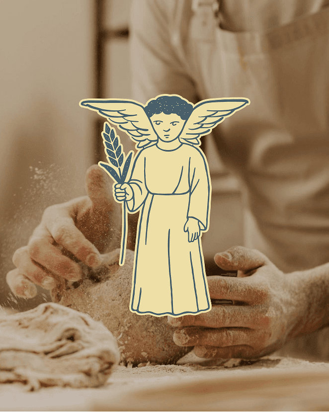
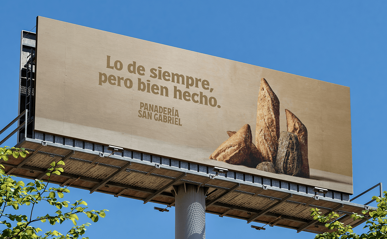
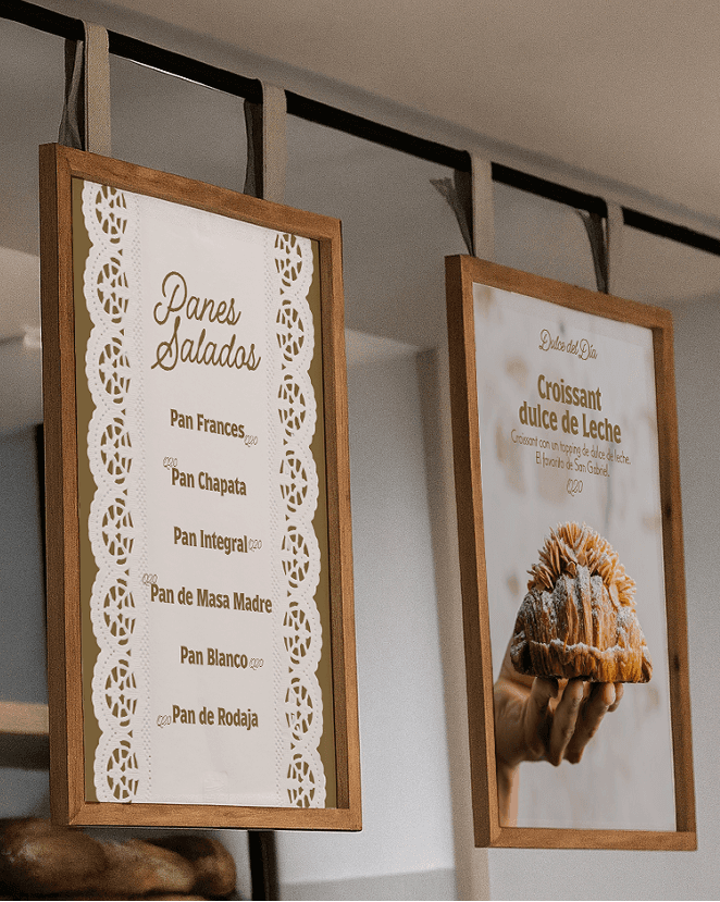
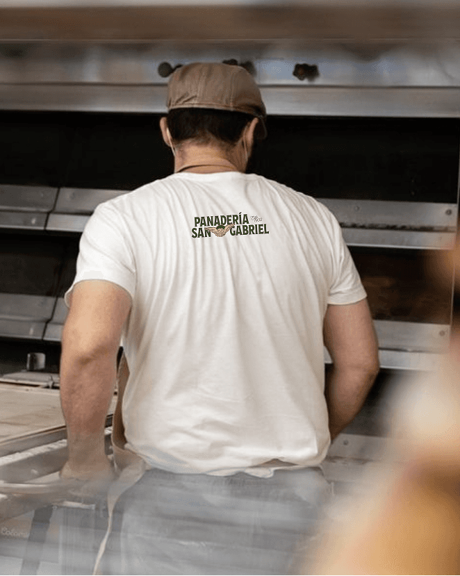
We approached the rebrand by reinterpreting the original logo, placing the angel icon at the center of the visual system. Through refinement and exploration, we developed a flexible set of icons and illustrations derived from this symbol, allowing the brand to express both heritage and modernity. The result is a cohesive visual language that respects San Gabriel’s legacy while giving it renewed clarity, character, and versatility across physical spaces, packaging, and brand touchpoints.
Solution
We approached the rebrand by reinterpreting the original logo, placing the angel icon at the center of the visual system. Through refinement and exploration, we developed a flexible set of icons and illustrations derived from this symbol, allowing the brand to express both heritage and modernity. The result is a cohesive visual language that respects San Gabriel’s legacy while giving it renewed clarity, character, and versatility across physical spaces, packaging, and brand touchpoints.
Solution
We approached the rebrand by reinterpreting the original logo, placing the angel icon at the center of the visual system. Through refinement and exploration, we developed a flexible set of icons and illustrations derived from this symbol, allowing the brand to express both heritage and modernity. The result is a cohesive visual language that respects San Gabriel’s legacy while giving it renewed clarity, character, and versatility across physical spaces, packaging, and brand touchpoints.
Solution
We approached the rebrand by reinterpreting the original logo, placing the angel icon at the center of the visual system. Through refinement and exploration, we developed a flexible set of icons and illustrations derived from this symbol, allowing the brand to express both heritage and modernity. The result is a cohesive visual language that respects San Gabriel’s legacy while giving it renewed clarity, character, and versatility across physical spaces, packaging, and brand touchpoints.






View More


Playing at the Studio:
Guatemala
PLACES, THE BLAZE
Madrid
BailE INolvIDable, BAD BUNNY
Playing at the Studio:
Guatemala
PLACES, THE BLAZE
Madrid
BailE INolvIDable, BAD BUNNY
Playing at the Studio:
Guatemala
PLACES, THE BLAZE
Madrid
BailE INolvIDable, BAD BUNNY
Playing at the Studio:
Guatemala
PLACES, THE BLAZE
Madrid
BailE INolvIDable, BAD BUNNY