Taxi Amarillo
La ciudad es tuya.
Guatemala, Guatemala | 2026
Transportation

Brief
Taxi Amarillo has been part of Guatemala City's streets for decades. The yellow fleet is one of those rare brands that everyone recognizes without ever having been designed. The challenge wasn't awareness. It was trust. With ride-sharing apps reshaping how people move through the city, Taxi Amarillo needed to evolve: to carry the weight of its history while showing up as something people actively choose, not just settle for. The brief was a full rebrand built around one idea: making the most familiar taxi in Guatemala feel like the best one.
Brief
Taxi Amarillo has been part of Guatemala City's streets for decades. The yellow fleet is one of those rare brands that everyone recognizes without ever having been designed. The challenge wasn't awareness. It was trust. With ride-sharing apps reshaping how people move through the city, Taxi Amarillo needed to evolve: to carry the weight of its history while showing up as something people actively choose, not just settle for. The brief was a full rebrand built around one idea: making the most familiar taxi in Guatemala feel like the best one.
Brief
Taxi Amarillo has been part of Guatemala City's streets for decades. The yellow fleet is one of those rare brands that everyone recognizes without ever having been designed. The challenge wasn't awareness. It was trust. With ride-sharing apps reshaping how people move through the city, Taxi Amarillo needed to evolve: to carry the weight of its history while showing up as something people actively choose, not just settle for. The brief was a full rebrand built around one idea: making the most familiar taxi in Guatemala feel like the best one.
Brief
Taxi Amarillo has been part of Guatemala City's streets for decades. The yellow fleet is one of those rare brands that everyone recognizes without ever having been designed. The challenge wasn't awareness. It was trust. With ride-sharing apps reshaping how people move through the city, Taxi Amarillo needed to evolve: to carry the weight of its history while showing up as something people actively choose, not just settle for. The brief was a full rebrand built around one idea: making the most familiar taxi in Guatemala feel like the best one.


Solution
We built the identity around what Taxi Amarillo already owned: yellow. Rather than softening it or dressing it down, we pushed it further, pairing it with black to create a high-contrast, premium visual system that turned every vehicle into a moving brand statement. The result is a fleet that looks intentional from every angle, and a service that communicates quality before a single word is spoken.
Solution
We built the identity around what Taxi Amarillo already owned: yellow. Rather than softening it or dressing it down, we pushed it further, pairing it with black to create a high-contrast, premium visual system that turned every vehicle into a moving brand statement. The result is a fleet that looks intentional from every angle, and a service that communicates quality before a single word is spoken.
Solution
We built the identity around what Taxi Amarillo already owned: yellow. Rather than softening it or dressing it down, we pushed it further, pairing it with black to create a high-contrast, premium visual system that turned every vehicle into a moving brand statement. The result is a fleet that looks intentional from every angle, and a service that communicates quality before a single word is spoken.
Solution
We built the identity around what Taxi Amarillo already owned: yellow. Rather than softening it or dressing it down, we pushed it further, pairing it with black to create a high-contrast, premium visual system that turned every vehicle into a moving brand statement. The result is a fleet that looks intentional from every angle, and a service that communicates quality before a single word is spoken.


Graphic System
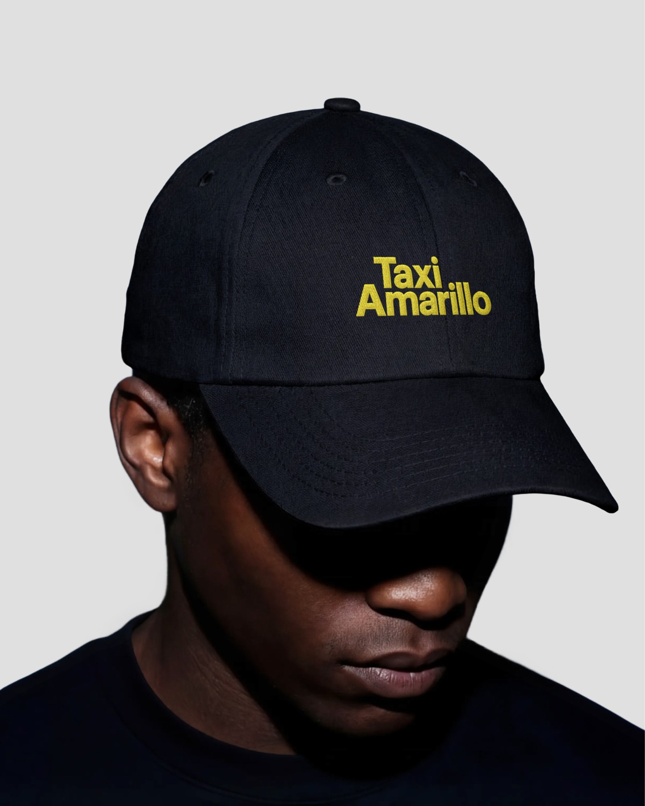
The graphic system is rooted in the visual language of road infrastructure. Warning diamonds, directional chevrons, navigation arrows, bold geometric cuts. The shapes that already govern how we read the city were abstracted and refined into a cohesive set of marks, icons, and patterns. The TA logomark itself reads like a destination: a letter and an arrow, a name and a direction. This road signage DNA scales across every application, from the vehicle wrap to a keychain, from a billboard to a watch face, keeping the system legible and alive at any size. The city has always spoken in signs. We just gave Taxi Amarillo its own.
Graphic System
The graphic system is rooted in the visual language of road infrastructure. Warning diamonds, directional chevrons, navigation arrows, bold geometric cuts. The shapes that already govern how we read the city were abstracted and refined into a cohesive set of marks, icons, and patterns. The TA logomark itself reads like a destination: a letter and an arrow, a name and a direction. This road signage DNA scales across every application, from the vehicle wrap to a keychain, from a billboard to a watch face, keeping the system legible and alive at any size. The city has always spoken in signs. We just gave Taxi Amarillo its own.
Graphic System
The graphic system is rooted in the visual language of road infrastructure. Warning diamonds, directional chevrons, navigation arrows, bold geometric cuts. The shapes that already govern how we read the city were abstracted and refined into a cohesive set of marks, icons, and patterns. The TA logomark itself reads like a destination: a letter and an arrow, a name and a direction. This road signage DNA scales across every application, from the vehicle wrap to a keychain, from a billboard to a watch face, keeping the system legible and alive at any size. The city has always spoken in signs. We just gave Taxi Amarillo its own.
Graphic System
The graphic system is rooted in the visual language of road infrastructure. Warning diamonds, directional chevrons, navigation arrows, bold geometric cuts. The shapes that already govern how we read the city were abstracted and refined into a cohesive set of marks, icons, and patterns. The TA logomark itself reads like a destination: a letter and an arrow, a name and a direction. This road signage DNA scales across every application, from the vehicle wrap to a keychain, from a billboard to a watch face, keeping the system legible and alive at any size. The city has always spoken in signs. We just gave Taxi Amarillo its own.




View More


Playing at the Studio:
Guatemala
PLACES, THE BLAZE
Madrid
BailE INolvIDable, BAD BUNNY
Playing at the Studio:
Guatemala
PLACES, THE BLAZE
Madrid
BailE INolvIDable, BAD BUNNY
Playing at the Studio:
Guatemala
PLACES, THE BLAZE
Madrid
BailE INolvIDable, BAD BUNNY
Playing at the Studio:
Guatemala
PLACES, THE BLAZE
Madrid
BailE INolvIDable, BAD BUNNY